
I have seen how quickly workforce plans can fall apart during a busy day. An unexpected absence, sudden increase in demand, or delayed shift handoff can leave managers working with information that is already outdated. By the time a conventional report reveals the problem, employees may be overworked, service levels may have declined, and overtime costs may already be unavoidable.
That is why I consider real time workforce management dashboards more than attractive reporting screens. They function as operational control centers that bring scheduling, attendance, demand, productivity, and labor-cost information into one current view. The goal is not simply to see more data. It is to identify emerging problems early enough to make a useful decision.
What Makes a Workforce Dashboard Real Time?
A real-time dashboard continuously receives information from connected workforce systems. Depending on the technology, information may update instantly, every few seconds, or at short scheduled intervals.
This differs from a historical report that summarizes what happened yesterday, last week, or during the previous pay period. Historical reporting remains valuable for long-term planning, but it cannot help a supervisor respond to an employee who has not arrived or a location where demand has unexpectedly increased.
Organizations should clarify how frequently every data source updates. A dashboard cannot provide reliable live visibility when its scheduling records refresh every minute but its attendance information only updates overnight. Managers should also see a visible “last updated” timestamp so they know whether they are reviewing current information.
Why Live Workforce Visibility Matters
Workforce conditions rarely follow a plan perfectly. Employees become unavailable, work takes longer than expected, sales volume changes, and equipment or transportation problems affect operations. A live dashboard compares planned conditions with actual conditions, showing managers where performance has started to deviate.
That visibility supports faster scheduling decisions. Managers can reassign qualified employees, offer open shifts, move breaks, activate backup coverage, or redistribute work. Early intervention can prevent a temporary imbalance from becoming a full-day operational problem.
Live information also improves labor-cost control. Instead of discovering excessive overtime after payroll closes, supervisors can see employees approaching overtime thresholds and adjust coverage beforehand. This changes workforce reporting from retrospective documentation into preventive management.
Essential Metrics to Display
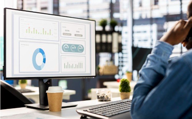
A useful dashboard should prioritize a limited number of actionable measurements. Adding every available data point creates clutter and makes urgent information harder to recognize.
Scheduled Versus Actual Staffing
This comparison shows whether enough employees are present to meet expected demand. It should allow managers to filter information by location, department, role, skill, and shift.
Schedule Adherence
Schedule adherence measures whether employees are completing their expected activities at the correct times. Low adherence may result from late arrivals, extended breaks, outdated schedules, technical problems, or unrealistic workloads. Managers should investigate the cause instead of assuming every exception represents poor performance.
Absence and Attendance Exceptions
Live attendance data can highlight missed clock-ins, unexpected absences, early departures, and late arrivals. Alerts should appear only when intervention is necessary, preventing supervisors from being overwhelmed by minor notifications.
Overtime Exposure
An overtime view should show hours already worked, projected hours, employees approaching a threshold, and the likely financial impact. Combining this information with open-shift data helps managers find less costly coverage alternatives.
Capacity, Demand, and Utilization
Capacity shows how much work the available team can reasonably complete, while demand represents the workload requiring attention. Utilization indicates how much available capacity is currently being used. Displaying these measurements together helps managers recognize both understaffing and excess coverage.
Labor Cost and Productivity
Managers need visibility into scheduled labor cost, actual labor cost, cost per productive hour, and output against staffing levels. Productivity should be interpreted in context because output can be affected by work complexity, training, system interruptions, or differences between assignments.
Dashboard Views for Different Users

A single universal layout rarely works because supervisors, workforce planners, financial teams, and executives make different decisions.
A frontline supervisor needs immediate information about attendance, active employees, coverage shortages, pending tasks, and schedule exceptions. A scheduling manager needs forecast accuracy, open shifts, employee availability, skill coverage, and overtime exposure.
Financial teams require labor spending, budget variance, premium pay, and cost trends. Executives need a concise overview of service levels, workforce capacity, productivity, retention risk, and major exceptions. Role-based access also protects sensitive payroll and employee information from unnecessary exposure.
Turning Alerts Into Specific Actions
A dashboard creates value only when displayed information leads to an appropriate response. Every major alert should therefore have a defined threshold, responsible owner, and recommended next step.
If staffing falls below demand, the dashboard might suggest qualified available employees or approved backup workers. If overtime begins increasing, it could identify alternative coverage. When adherence declines, a supervisor should be able to examine the affected shift, activity, or system before contacting an employee.
Modern systems may use predictive analytics to estimate how current conditions will affect later service levels or costs. Here, workforce analytics tools can help managers identify emerging staffing risks before labor expenses increase. However, automated recommendations should remain explainable, as managers need to understand why an action was suggested before accepting it.
Integrations Needed for Reliable Information
Live dashboards depend on connected and consistent data. Common sources include scheduling software, time clocks, payroll systems, human resources platforms, task-management tools, customer-service platforms, and demand-forecasting systems.
Native integrations and APIs can reduce manual reporting, but data governance remains essential. Employee identifiers, job titles, locations, time zones, and labor-cost definitions must remain consistent across systems. Otherwise, a polished dashboard can confidently display inaccurate conclusions.
Organizations should also establish rules for missing records, duplicate entries, delayed updates, and employee status changes. Clear metric definitions prevent departments from debating numbers during important decisions.
Design Practices That Improve Usability
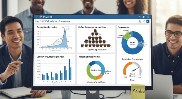
Critical KPIs should appear at the top of the screen, followed by trends, exceptions, and detailed drill-downs. Color should indicate urgency consistently and should never be the only method used to communicate status.
Filters should help users examine a particular location, team, role, shift, or time range without creating multiple disconnected reports. Mobile access is useful for managers working across facilities, although the mobile view should emphasize alerts and essential actions rather than attempting to reproduce a complex desktop layout.
Privacy also deserves careful attention. Organizations should use role-based permissions, secure data transmission, audit logs, and clear employee-monitoring policies. Employees should understand what information is collected, why it is collected, and how it affects workplace decisions.
How to Implement a Dashboard Successfully
Implementation should begin with decisions rather than charts. Leaders must identify the recurring workforce questions that currently take too long to answer. The first version should focus on a small group of high-value KPIs, such as staffing coverage, attendance exceptions, adherence, overtime risk, and labor cost.
A pilot involving one department or location can expose integration problems and unclear definitions before a wider rollout. Teams should then measure whether the dashboard reduces response time, prevents overtime, improves coverage, or limits manual reporting.
Frequently Asked Questions
1. What are real time workforce management dashboards?
Real time workforce management dashboards are visual interfaces that combine current scheduling, attendance, staffing, productivity, demand, and labor-cost information to help managers recognize problems and respond promptly.
2. How many KPIs should a dashboard contain?
The main view should usually contain five to eight high-priority KPIs. Additional measurements can remain available through filters and drill-down screens.
3. Can a live dashboard reduce overtime?
Yes. It can warn managers when employees approach overtime thresholds and reveal scheduling gaps early enough to arrange alternative coverage.
4. What is the difference between a dashboard and a report?
A dashboard supports continuous monitoring and immediate decisions. A report generally provides detailed historical information for analysis, documentation, or periodic reviews.
Final Thoughts
I believe the most effective workforce dashboard is not the one containing the largest number of charts. It is the one that helps the right manager recognize an important change, understand its cause, and take a responsible action before the problem grows.
When live staffing, attendance, demand, and cost information are supported by reliable integrations and clear policies, workforce management becomes more proactive. Organizations can protect employees from preventable overload, maintain steadier operations, and make decisions based on current conditions rather than yesterday’s reports.
Leave a Reply